Unlocking the Power of Web Accessibility Anderson Caviedes2024-04-24T15:45:07+00:00 Unlocking the Power of Web AccessibilityAnderson Caviedes2024-04-24T15:45:07+00:00
Increase Engagement: The Power of Interactive Tools and Feedback Anderson Caviedes2024-04-16T18:19:53+00:00 Increase Engagement: The Power of Interactive Tools and FeedbackAnderson Caviedes2024-04-16T18:19:53+00:00
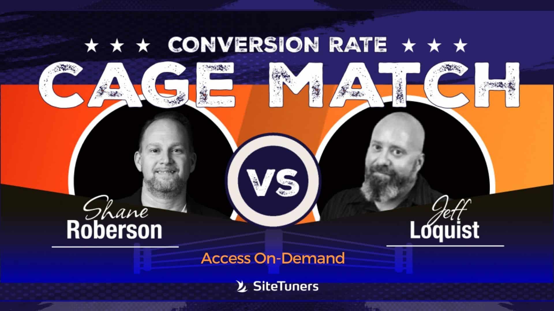
Webinar: Conversion Rate Cage Match – Battle of the CRO Titans 3! Anderson Caviedes2024-04-25T17:44:29+00:00 Webinar: Conversion Rate Cage Match – Battle of the CRO Titans 3!Anderson Caviedes2024-04-25T17:44:29+00:00
Celebrating Success: SiteTuners Won Inc 5000 Southeast Anderson Caviedes2024-04-02T20:55:44+00:00 Celebrating Success: SiteTuners Won Inc 5000 SoutheastAnderson Caviedes2024-04-02T20:55:44+00:00
Discount Pricing Strategies Online Stores Should Consider Anderson Caviedes2024-03-11T19:06:48+00:00 Discount Pricing Strategies Online Stores Should ConsiderAnderson Caviedes2024-03-11T19:06:48+00:00
SiteTuners is an Awardee in The 2024 Manifest Awards! Anderson Caviedes2024-03-27T16:28:26+00:00 SiteTuners is an Awardee in The 2024 Manifest Awards!Anderson Caviedes2024-03-27T16:28:26+00:00
Augmented Reality in E-commerce: Revolutionizing Online Shopping and CRO Anderson Caviedes2024-03-14T14:47:08+00:00 Augmented Reality in E-commerce: Revolutionizing Online Shopping and CROAnderson Caviedes2024-03-14T14:47:08+00:00
Webinar: How to Use Video for Conversion Rate Optimization Anderson Caviedes2024-04-01T22:05:24+00:00 Webinar: How to Use Video for Conversion Rate OptimizationAnderson Caviedes2024-04-01T22:05:24+00:00
Mastering E-commerce Website Design: Strategies for Success Anderson Caviedes2024-02-22T19:52:46+00:00 Mastering E-commerce Website Design: Strategies for SuccessAnderson Caviedes2024-02-22T19:52:46+00:00
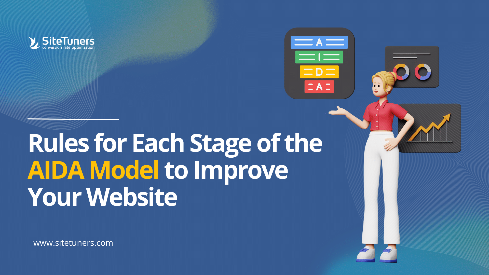
Rules for Each Stage of the AIDA Model to Improve Your Website Marty Greif2024-02-22T18:37:46+00:00 Rules for Each Stage of the AIDA Model to Improve Your WebsiteMarty Greif2024-02-22T18:37:46+00:00