 When most people think of the big names in online marketing, they usually think of practitioners in the space: Avinash Kaushik for analytics, Tim Ash for conversions, Jakob Nielsen and Steve Krug for usability, or Rand Fishkin and Danny Sullivan for SEO.
Edward Tufte is often a name just referenced in the academe, like Pirolli and Card for the information foraging theory, or George Miller for the magic number 7, plus or minus two.
But Tufte’s body of work, while about information as a whole, and not web information specifically, might as well have been designed with the web in mind. Most professionals would do well to learn from Envisioning Information and The Visual Display of Quantitative Information, especially if they directly deal with graphics and information architecture.
It turns out, Tufte’s body of work is indispensible to the modern online marketer – here are some of the most critical things to learn from him.
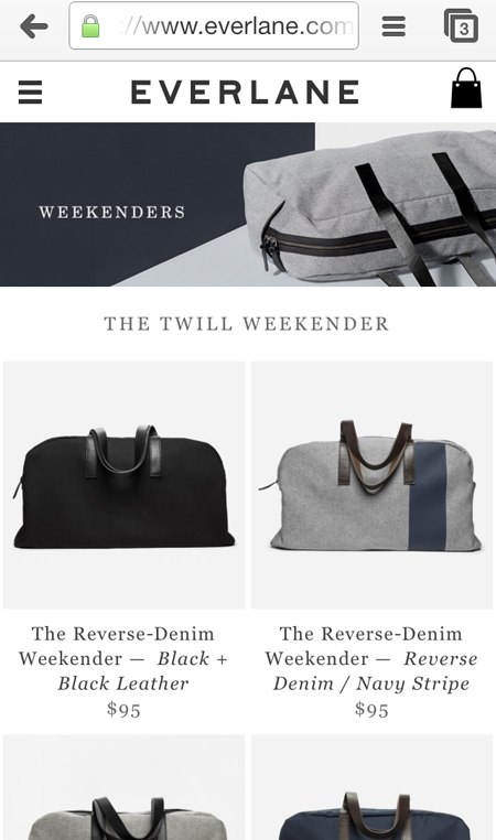
“Above all else, show the data.”
Tufte was not talking about mobile versus desktop, or the chrome to content ratio when he talked about this, but he may as well have been. The most important job of a screen is to convey information, to display content.
Now, obviously, you have to balance that against a person being able to find what he or she needs to get there in the first place. On desktops, you can afford to have primary navigation, left navigation, mega-menus. Those things that are largely referred to in the digital space as “chrome,” and on mobile, you have very little space for it.
Good chrome to content ration ensures that navigation does not get in the way of content
Above everything else – above displaying your ads, getting your brand messaging across, your screen needs to be comprised of data or content that the user needs. You have to think about ways to minimize the chrome, and maximize the content, while still keeping navigation elements accessible. With information display, as with web, showing the content is job number one.
We’ve written before about optimizing space for content – you can read that to learn more about optimizing the chrome to content ratio.
“To clarify, add detail.”
It reads like a counter-argument against flat design, doesn’t it?
The argument is that clutter and overload are not inherent to information; they are, in essence, design failures.
Just as true about displaying numbers as they are about adding signifiers that calls-to-actions are clickable buttons, adding detail that helps distinguish between items is a hallmark in web usability. It is actually a principle that’s currently being eroded, to a degree, by flat design – try not to fall into that trap, if you can.
On the web, simplicity is key – that much is a given. That is not a license to throw relevant content out; rather, it’s an incentive to fix your design. You can reduce the number of elements and add cognitive load; just the same, you can add signifiers (not clutter, mind you) that add detail, and still keep things simpler for the user.

Details like signifiers of clickability, when carefully thought-out, can reduce complexity for the visitors by clarifying what is and is not something they can interact with.
We’ve written about what makes calls-to-action work before – you can read on to find out what makes CTAs work.
“Encourage the eye to compare different pieces of data.”
For pure data, this means minimizing the ink and the space used to convey the greatest number of ideas for the user. A great example of this is sparklines for stock value.
With web information in mind, comparisons are usually derived from a few design variables, and they all have to do with the way eyes scan information. Eyes are drawn …
- from large objects to small ones
- from irregular shapes to regular shapes
- from dark elements to light elements
Now, with that in mind, look at the home page of Human Factors International:

Sizes, blocks, and colors encourage you to compare the top tasks. This is possible for home pages that do not waste space on a rotating banner.
Whether you’re getting your visitor to look at data sets or tasks on the web, the key is to make the comparisons easier. For data sets, you can use appropriate graphs to visually summarize information; for web pages, you can use size, shape, and color to convey weight and prioritization.
Please don’t take this to mean “make the CTA larger than your palm.” Tufte advocates making visual distinctions as subtle as possible, but still clear and effective.
Tufte’s body of work needs to be parsed and internalized – the three areas above help, but it really does help UX and conversion professionals to read through his work.